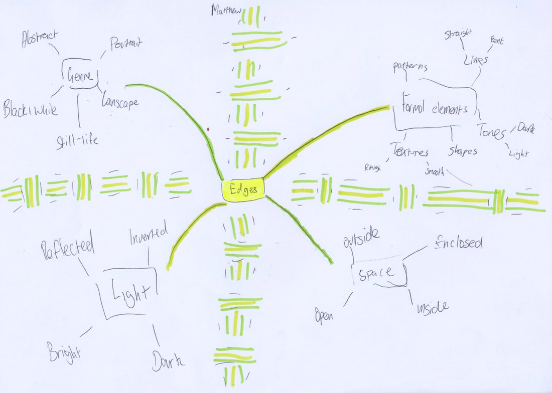
Edges Mindmap
Photos from the mirror lesson:
|
|
|
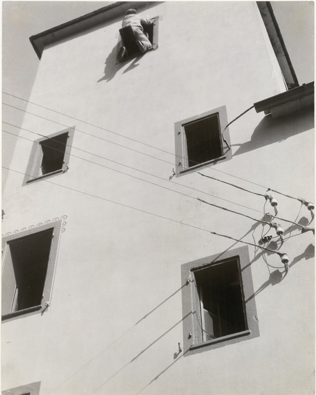
1) What kinds of edges can you see in this photo?
In this photo, there is a wiring system going off the frame, and the windows are edges as well. The weird ceiling support at the top right also has an edge like it wouldn't in real life. The top of the building has an edge unlike reality too. |
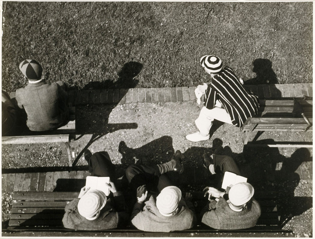
1) What kinds of edges can you see in this photo?
In this photo it is like an old video game, where when you go off the side of the screen you reappear at the opposite side of the screen. |
Photos from the "Looking Up, Looking Down" lessons (Lesson 1)


WWW: |
EBI: |
|
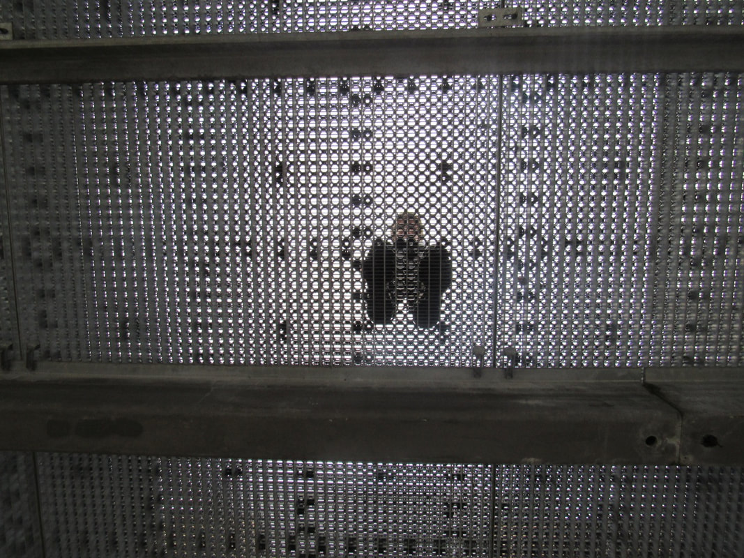
I think that the chequered sort of style worked well with this kind of photo. The bar on the bottom and on the top are perfectly alligned with the feet and they are both evenly spaced.
|
I think it could be better if I was looking straight, not down at the camera.
|
Photos from the "Looking Up, Looking Down" lessons (Lesson 2)
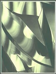
Alexander Rodchenko


Paper Folds / Light
In this lesson we took a A2 piece of paper, sellotaped it to a window / wall, and put an A4 piece on it. To create the edges, we folded the paper and taped it to the bigger paper. For some we shone a torch through the paper, and this is some of the pictures produced.
WWW: |
EBI |
|
The fold patterns in these photos are very nice and work well.
|
There isn't much contrast in colour, so it looks like a blank page.
|
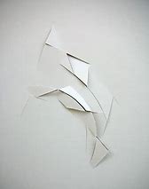
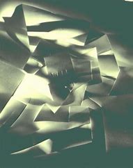
Francis Bruguière Vjeko Sager
|
|
Differences:
- In Francis Bruguière's art, it is a lot more aggressive and colourful that Vjeko's. It is also a lot bigger and a lot busier. |

Differences:
- In Vjeko Sagers art, it is a lot more sharp, and more simplistic. It is also more empty and small. |
Similarities:
- Both use shade and light very effectively
- They both have sharp and curled edges
- They're both very unique in their own ways.
- Both use shade and light very effectively
- They both have sharp and curled edges
- They're both very unique in their own ways.
WWW: |
EBI: |
|
I like how there is 2 versions of the bigger one. I also quite like how on the smaller one there is barely any light.
|
I am really mad at myself for letting my hand slip into the picture. If there is one thing i would do to make this better it would be to take my hand out of the photo.
|
Photos for sculpture
WWW: |
EBI: |
|
I like how the sculpture looks real. I also like how the sculpture is on the stage and not just on the floor.
|
I think it could be better if the sculpture was more centred or if it was smaller.
|
Edges Assessment.
Paragraph 1:
- Describe both of these photographs as carefully as you can. What can you see?
- What kinds / genre of photograph are they? (e.g: Portrait, Landscape, Still Life, etc.)
- What is surprising and / or unusual about these pictures? What things do you recognise and what things seem new to you?
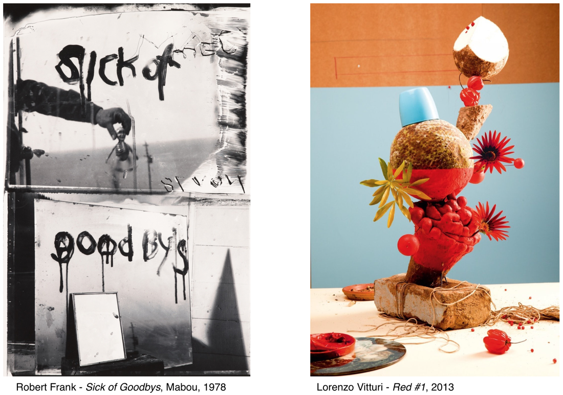
1) To describe this to a person who can't see these pictures, I would say that the one titled "Sick of goodbys" is a black and white photograph, and it is ataken on what seems like an extremely tall building. It is made up of 3 mirrors, 2 of which have the landscape of the skyline reflectied onto them. On the top mirror, there are 2 words, "Sick of" and there is a reflected date (1/10/78) on it. On the bottom mirror, there is the word "goodbys" and on the 3rd mirror, it looks like it is only really reflecting the sky. On the photo entitled "Red #1" there is an object that looks like a cake. On the cake-like object, there is an array of various fruits, like cherries, and peppers. There are also Coconuts, and weird looking exotic plants. All these objects are all in a tower, and in the background there is a blue background.
2) The genre of these photographs could be that they're both portrait, and they're both quite abstract. The image entitled "Sick of Goodbys" is a lot more dark, almost depressing, than the one titled "Red #1". This picture is a lot more colourful and bright.
3) I think the things that are unusual in this picture is that the thing that the person in Frank's photo is gripping. I can't tell what it is, but it looks like a grenade, or a toy figure of some description. In Vitturi's photograph, the thing that confuses me the most is the blue cup on top of the coconut. It's like the anomaly, it doens't have a reason or meaning behind it.
Paragraph 2:
- What are the main similarities and differences between these photographs? Think about the way that they are made, the way they look, their compositions, the use of Formal Elements (Line, tone, texture. pattern, focus, shape, etc.)
- How is space represented in these photographs (eg Foreground, Middleground, background, top to bottom, right to left.)
- Which parts of the photographs strike you as most interesting?
I think the similarities in this photograph are that they're both abstract, you can't really tell what the subject is. They're both taken from the same angle, maybe from a tabletop or a lower angle. They're both split in to sections, Frank's one has the top mirror lanscape, and the bottom mirror is portrait, and Vitturi's one has 2 different background colours. The blue background has the whole sculpture, while the orange section has the sliced coconut at the very top. The differences are that (obviously) one is black and white, and Vitturi's one is in colour. I think another difference in these 2 photos could be that the mood is different . Frank's photo is quite dark and depressing, while Vitturi's photo is colourful and joyous.
I think the most interesting part of Frank's picture is the date on the top mirror. We don't know what this date represents, maybe it could be the date that the photo is taken, but I would like to know why it is reversed and what happened on that day. I think the most interesting part on Vitturi's photo is the backgrounds, and the way that the blue cup is on the same colour background.
Paragraph 3:
- What kinds of edges can you see in the photographs?
- How does each photo make you think about the relationships between edges and photography?
- If you could talk to the artist / photographer, what questions would you ask them?
If I could ask anything to the artist, I would ask Frank what it was he was holding in his photo, and why he chose to spell "Goodbys" wrong.
I would ask Vitturi why he chose such exotic, obscure fruits, and why there is a blue cup.
If i could change the names of these photographs, I would change them to:
Sick of goodbys -> Child Loss
Red #1 -> FruitCakes
I think Vitturi chose to make his photo to represent all the foriegn fruits that are from opposite sides of the world. I think Frank chose to make his to represent how hard it is to lose not one, but 2 of your children.
- Describe both of these photographs as carefully as you can. What can you see?
- What kinds / genre of photograph are they? (e.g: Portrait, Landscape, Still Life, etc.)
- What is surprising and / or unusual about these pictures? What things do you recognise and what things seem new to you?
1) To describe this to a person who can't see these pictures, I would say that the one titled "Sick of goodbys" is a black and white photograph, and it is ataken on what seems like an extremely tall building. It is made up of 3 mirrors, 2 of which have the landscape of the skyline reflectied onto them. On the top mirror, there are 2 words, "Sick of" and there is a reflected date (1/10/78) on it. On the bottom mirror, there is the word "goodbys" and on the 3rd mirror, it looks like it is only really reflecting the sky. On the photo entitled "Red #1" there is an object that looks like a cake. On the cake-like object, there is an array of various fruits, like cherries, and peppers. There are also Coconuts, and weird looking exotic plants. All these objects are all in a tower, and in the background there is a blue background.
2) The genre of these photographs could be that they're both portrait, and they're both quite abstract. The image entitled "Sick of Goodbys" is a lot more dark, almost depressing, than the one titled "Red #1". This picture is a lot more colourful and bright.
3) I think the things that are unusual in this picture is that the thing that the person in Frank's photo is gripping. I can't tell what it is, but it looks like a grenade, or a toy figure of some description. In Vitturi's photograph, the thing that confuses me the most is the blue cup on top of the coconut. It's like the anomaly, it doens't have a reason or meaning behind it.
Paragraph 2:
- What are the main similarities and differences between these photographs? Think about the way that they are made, the way they look, their compositions, the use of Formal Elements (Line, tone, texture. pattern, focus, shape, etc.)
- How is space represented in these photographs (eg Foreground, Middleground, background, top to bottom, right to left.)
- Which parts of the photographs strike you as most interesting?
I think the similarities in this photograph are that they're both abstract, you can't really tell what the subject is. They're both taken from the same angle, maybe from a tabletop or a lower angle. They're both split in to sections, Frank's one has the top mirror lanscape, and the bottom mirror is portrait, and Vitturi's one has 2 different background colours. The blue background has the whole sculpture, while the orange section has the sliced coconut at the very top. The differences are that (obviously) one is black and white, and Vitturi's one is in colour. I think another difference in these 2 photos could be that the mood is different . Frank's photo is quite dark and depressing, while Vitturi's photo is colourful and joyous.
I think the most interesting part of Frank's picture is the date on the top mirror. We don't know what this date represents, maybe it could be the date that the photo is taken, but I would like to know why it is reversed and what happened on that day. I think the most interesting part on Vitturi's photo is the backgrounds, and the way that the blue cup is on the same colour background.
Paragraph 3:
- What kinds of edges can you see in the photographs?
- How does each photo make you think about the relationships between edges and photography?
- If you could talk to the artist / photographer, what questions would you ask them?
If I could ask anything to the artist, I would ask Frank what it was he was holding in his photo, and why he chose to spell "Goodbys" wrong.
I would ask Vitturi why he chose such exotic, obscure fruits, and why there is a blue cup.
If i could change the names of these photographs, I would change them to:
Sick of goodbys -> Child Loss
Red #1 -> FruitCakes
I think Vitturi chose to make his photo to represent all the foriegn fruits that are from opposite sides of the world. I think Frank chose to make his to represent how hard it is to lose not one, but 2 of your children.
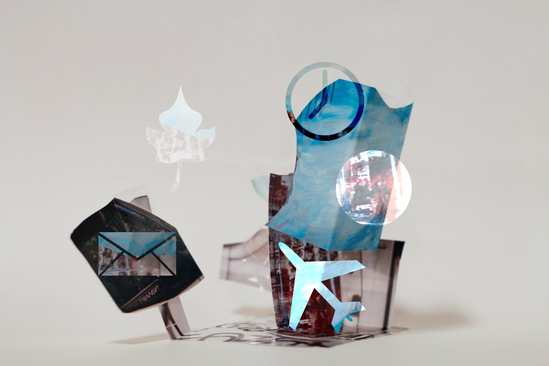
Photoshop Clipping Practise
Today in class, we practised some photoshop skills in the form of clipping. We had to take a shape, put the clipping option on it, and then move the background layer to make this.
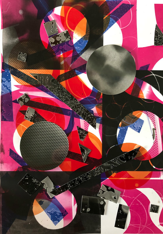
Assessment check up - 4 Weeks
After 4 weeks of the Edges assessment, I think I have made significant progress. What I have done so far is: I have made around 15 photograms and i have cut them into unique shapes. What I am going to do is use photograms and cut various irregular shapes and stick them onto a larger piece of sugar paper. After this I am going to cut the sugar paper into more shapes and stick them together using some black and white images from the Slider Projector. My inspiration for some of the work i am doing is from Francis Bruguière and Vjeko Sager. I took inspiration from these photographers becuase some of the cuts / shapes I am making look like some of the works we did from Francis Bruguière and Vjeko Sager. Also the sharp edges on some of the photograms i have already made look like something Vjeko Sager would do.
Assessment Evaluation
Which ideas did you have about edges in Photography?
- I had the idea of using Photograms as the base of the piece. I made the various pictures all on the sheet. I also had the idea of presenting the final piece in a frame and on sugar paper.
What kinds of edges have you explored in your work?
- I explored the idea of using photograms as the main edges, and the idea of overlaying them to create various irregular shapes and edges.
Explain your best idea.
- I think the best idea that was used in the final piece was the idea of colourising them, and overlaying them in the photocopier.
What kinds of experiments have you carried out during the edges project?
- I carried out a lot of experiments in the dark room, like using different kinds of equipment to cover the paper and took into consideration the idea of the inverted colours. I also experimented a lot with the colours I used in the final piece, and decided that those ones were the best ones.
Which experiments worked best and why?
- I think the photograms i used in the final piece were the best experiments. This is because they all had their own variety of edges, for example the ones that I used string and scissors with created their own edges and they all worked in their own ways.
How have you developed and refined particular experiments during the project?
- I persisted a lot with trying to get the perfect photo where i included string and scissors. I thought they worked so well as a combination but no photo seemed to reflect it that well. The one that i have used was in fact a mistake, but it was the best mistake i have ever made to be honest.
What final outcomes did you make during the project?
- I made the final 3 pieces include a lot of complimentary colours, for example the pink one has a lot of blue and red to go along with it, and that worked really well. I also decided to put the final pieces in frames.
What has been the most important thing you have learned during the edges project?
- PERSIST WITH THE DARKROOM! I had so many issues with the photograms and the ones i chose in the final were mostly mistakes.
The Final Outcomes.

|

|
|
^^ my personal favourite is this one
