Introduction to the Project
In a time of crisis like this, with COVID-19 restricting our movements, artists are forced to think up some interesting concepts to pass the time. Make do and Mend represents this idea perfectly, with the main idea being working with what you have. The first issue of Make do and Mend was present in the times of WW2, where there was heavy rationing during, and for a long while after, the war. In my opinion, embracing and having to make something good out of these natural constraints has been an exciting challenge to grasp and work upon. I think the first tries at this concept were extremely difficult, as they were foreign - I had never had to work under such heavy constraints before. Simply having a picture and a pair of scissors was a large challenge to work under, but after the first few tries, I really understood the ideas and it started to become easier for me. The main ideas of Make do and Mend is a fun concept to try and get to work under, and the times of COVID make it easy to confine yourself into a long-term challenge.
First Collage - Practice


First Experiment Analysis
|
Original Image
|
Modified Image - Final Product
|
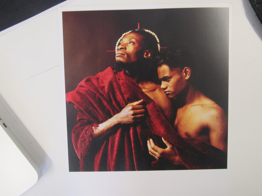
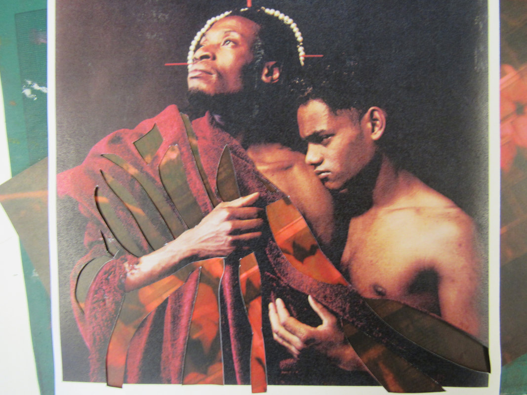
I started off this project with an ethnic image from 1989 (Image 1). There were a wide range of images to choose from, and I decided to go with this one because it seemed to be the only image that represented a wide range of minorities, like the LGBT+ community and black people at the same time. I started by simply deciding on the sections of the image that I wanted to keep and the parts of the image that I thought were not significant. I thought that the stance and positioning of both men were symbolic, as well as their facial expressions and bodies. I concluded on only cutting out the cloak, but only the darker sections of it. After a few delicate cuts, and a couple of mistakes, I ended up with a nicely cut out image. I was then instructed to put a background behind the image and its cuts, and the two "default" ones I had the decisions of are in the 7th image. I decided that neither of the images brought out potential, so I looked for some more images to place in the background. I found an image of a sunset at the beach, taken at such a time where the horizon is a luminescent yellow (Image 8). I found an image of a red chilli pepper on a blue background and put that behind the collage (9th image). The other two are angles of the same image, of a shop front - image 10 is from a blue perspective and image 11 is from a red one.
Overall, I think that this photoshoot turned out very nicely. I was not present for the first practice of this, so for a first attempt, I think it looks extremely clean. I think that the large cut at the bottom, cutting out most of the bottom half of the cloak, was a large mistake on my behalf and that it doesn't look very clean. Other than this, the collage itself (I think) is well thought out and was worth the hour it took to construct.
The backgrounds of the images all look average, apart from the one with the red shopfront. I like this one because it resembles the original image, a red background instead of a red cloak. The other backgrounds were experiments that didn't pay off, I don't really like any of them; they are all too high of a contrast compared to the dark background and the impactful, symbolic posture of the people.
Threshold Concepts
|
The ten Threshold Concepts all relate back to the base ideas of Photography. I particularly agree with the ideas of TC#10, which states, "Photographs warp our sense of time; they remind us of things lost". What this means is, that photographs can be used as a source of storing time, it captures a single moment in time and can be stored and kept forever. I think this can relate to the "Make do and Mend" project, since it mainly relies on already existing photographs, that artists refine and "Mend". What I mean here is, artists make do with the existing photographs from old, past times. What they then do it mend it, refining it and making it modern or defacing it in a comedic fashion. There are many examples of this, for example the Mona Lisa was defaced by an artist named Marcel Duchamp, who added a small moustache and beard to her internationally recognised, iconic face. He named it L.H.O.O.Q - a french pun that when sounded phonetically, sounds like the french phrase "Elle a chaud au cul"; which in english means "She has a hot ass". This concept basically started the idea of Making do and Mending.
|

|
Second attempt at Collages


Second collage attempt - Analysis
|
Original Image

|
Modified Image - Final Product

|
First of all, these images were extremely difficult to understand. The first step I always take when cutting up images is simply looking at the images and deciding what is significant, and what is not. These images were clearly about modelling, and maybe the clothing side of it - but that made it a lot harder to decide what to cut off.
I decided to take a large risk with the first image and cut off the womans' clothing. It was a risk that started off with simply the small necklace. I thought that it looked nice, so then I decided to carry on with the experiment by cutting off small sections of her sleeves, and I realised that it was a huge mistake - but I compensated by just cutting off the entire thing. In the end, this looked better than my first idea - which was to chop small patterns out of it. I then decided to cut her jewellery off - which proved to be a risk worth taking, as ultimately this turned out a lot nicer that I expected. I finished by cutting off some other bits and pieces. I then went to find an appropriate background for the image. I found the one I used rather quickly - I just found it inside of a book in class. It works well with the contrasting clothes and background colours. The same goes for the second image - I decided what was important and what is not. I thought that the posture and the stance of the character in the centre was significant, however I still thought it would look nice the cut out his tattoos, which seemed nice in the end. I then decided to cut off the railing he was leaning on and the factories behind him. The background here looks nice, I think it contrasts well with the background as the pink is not a colour that you see naturally often.
I decided to take a large risk with the first image and cut off the womans' clothing. It was a risk that started off with simply the small necklace. I thought that it looked nice, so then I decided to carry on with the experiment by cutting off small sections of her sleeves, and I realised that it was a huge mistake - but I compensated by just cutting off the entire thing. In the end, this looked better than my first idea - which was to chop small patterns out of it. I then decided to cut her jewellery off - which proved to be a risk worth taking, as ultimately this turned out a lot nicer that I expected. I finished by cutting off some other bits and pieces. I then went to find an appropriate background for the image. I found the one I used rather quickly - I just found it inside of a book in class. It works well with the contrasting clothes and background colours. The same goes for the second image - I decided what was important and what is not. I thought that the posture and the stance of the character in the centre was significant, however I still thought it would look nice the cut out his tattoos, which seemed nice in the end. I then decided to cut off the railing he was leaning on and the factories behind him. The background here looks nice, I think it contrasts well with the background as the pink is not a colour that you see naturally often.
27/11/20 - Making Day


Making Day Analysis
This six hour day was not the most productive in terms of final pieces, although what came out of it in the end, in my opinion, turned out extremely well.
I began by looking for some inspiration from the various artists that we have researched throughout the past few lessons. I decided to take inspiration from the artist Matt Lipps, of which I have done a lot of inspired work from throughout the past two or three lessons. From studying his work, he always has a set theme for his final pieces - whether it be men, women, or even architecture. I knew I needed to find a theme for my final piece - so I got looking.
I started off by looking through a small magazine full of a range of images. I looked through the magazine, not really looking for anything in particular. I was mainly looking for interesting images that could provide a range of outcomes - nothing too closed, nothing that will take a long time to find a mass amount of images for. I decided to go with the theme of "Men in Suits", which proved itself to be a strict topic.
I began cutting out some random images of men in suits, which started off as a very dull, black and dark blue colour palette. I was close to choosing an entirely new theme, when I found a magazine that was dedicated to mens fashion - and suits were not difficult to come by. I found some very brightly coloured suits, which didn't look too out of place in my theme. These definitely helped the image look a lot more appealing, although there was definitely a lack of interesting, brightly coloured images in the magazine. I made the decision to instead broaden out the theme of my project to men in formal clothing, which definitely made it easier to find examples of. I began cutting the images out.
The first experiment I made was cutting out the subject's face, which I thought looked a lot nicer. It removed the primary interest from the people's face on to their suits, which is exactly what I wanted. I did this for all of the images, and they all looked very interesting and unique. There were no images that looked the same without their faces, and there were no images that looked out of place. After nearly wasting three hours finding and cutting these images to exactly my liking, I stuck them onto some black card, and began constructing the image.
I decided to use some green card to arrange the images and see what they looked like with the colour background behind it. It was more or less the stepping stone to using the proper, studio backgrounds. This was not too difficult to do, as it was all on the table, lying flat. The problem came when I had to make it look 3D.
The stands took literally forever to cut out, put on, and actually stand the image up. I probably wasted the upper half of an hour trying to figure out what I was doing, and then actually get the images stood up. The stands were small pieces of card in a triangular shape, the flat parts lying on the image itself and the table. This made the process so much harder to do, as there was no metal rods I could use, or any proper stands. They were so tedious to figure out. After nearly an hour, I finally managed to get the images all stood up, for the most part. The one image of the man in the brightly coloured suit was too small to fit a stand on, so I had to lean that image on the arm of another image, which can be seen on the images with the red background.
I decided to arrange them in such an order that made it from largest to smallest from back to front. I think this turned out a lot nicer than anything else I tried did. I tried to mix it up with randomness which made the large images look a lot more overpowering from the other, smaller images. This was the case with all of the setups, other than the one I used. I think this looked very unique in the end.
I thought that the image needed a nice looking background. I didn't want anything too flashy, or anything too dark. I looked through a large book of A3 images and found the one I used in the end. It was a large image with water reeds and plants. I cut these plants out, leaving me with a large amount of silhouettes that looked like water reeds. I made a large mistake during this, accidentally cutting a large portion off of the image, but in the end I made it work, making it somewhat symmetrical. I set up the images once more on the backdrop, took some images, and was left with the images you see on the top of this analysis.
I personally really dislike the making of the image, but the final product looks decent. If I were to change anything it would be to use an even broader theme, as I think this was too enclosed and did not provide enough opportunity. I would also use a different backdrop for the image, I think the black is too bland and boring. I do like the first product that was made - the one with the red backdrop - because it is very eye-catching and interesting to look at - especially the suits, which was the main topic of the image.
"Found" Photographs


"Found" Photography - Analysis.
This small project was a lot of fun to carry out, especially having a preset list of photos I needed to take.
This lesson began with looking for a sufficient image that I could place around in interesting locations and states. I chose this image because you can't really tell what it is; I looked at it for about 5 minutes unable to decipher what the statue looking figure is. The list consisted of 16 different prompts to carry out (Hover over the images to see each image for each prompt). The image chosen was a good choice in the long run, as I think a lot of the images produced are very interesting to look at. I also believe that the list provided for a lot of opportunity, I don't think that there were any sort of incorrect prompts that did not at least provide an outcome of some description. The first few prompts started out as very simple, nothing that I could not have thought of without the list. The first problem arose on the third image. The prompt was "Shine a light on the image" - however it was a very gloomy day with no sunlight. I had to settle for a phone light which was not very effective on the final product, as seen in the third image. From this point on, the prompts became more creative which was good in terms of the final product. Another issue arose on the photocopying prompt, when the image was not photocopied correctly. I settled for the fully black image, as when I scrunched it up, it still looked interesting enough to put it into the final product. I really like the final few images, especially the soaked in water prompt along with the paper airplane one. In sync, these two in particular worked very well, as I believe that the creases in the page and the water worked extremely well together. The final few prompts were simple, but they still looked great in the final product. Overall, I believe that the project was both interesting in terms of carrying out the product and the final product. If I were to change anything, it would probably be the length of the project, as I think that while this was interesting to carry out, I think that there were not enough images.
This lesson began with looking for a sufficient image that I could place around in interesting locations and states. I chose this image because you can't really tell what it is; I looked at it for about 5 minutes unable to decipher what the statue looking figure is. The list consisted of 16 different prompts to carry out (Hover over the images to see each image for each prompt). The image chosen was a good choice in the long run, as I think a lot of the images produced are very interesting to look at. I also believe that the list provided for a lot of opportunity, I don't think that there were any sort of incorrect prompts that did not at least provide an outcome of some description. The first few prompts started out as very simple, nothing that I could not have thought of without the list. The first problem arose on the third image. The prompt was "Shine a light on the image" - however it was a very gloomy day with no sunlight. I had to settle for a phone light which was not very effective on the final product, as seen in the third image. From this point on, the prompts became more creative which was good in terms of the final product. Another issue arose on the photocopying prompt, when the image was not photocopied correctly. I settled for the fully black image, as when I scrunched it up, it still looked interesting enough to put it into the final product. I really like the final few images, especially the soaked in water prompt along with the paper airplane one. In sync, these two in particular worked very well, as I believe that the creases in the page and the water worked extremely well together. The final few prompts were simple, but they still looked great in the final product. Overall, I believe that the project was both interesting in terms of carrying out the product and the final product. If I were to change anything, it would probably be the length of the project, as I think that while this was interesting to carry out, I think that there were not enough images.
30/04/21 - Making Day


Final Piece 1
These first three collages are a result of a collaborative project spanning over the first hour and a half of the making day. A partner and I both collected five images, each with a set subject - usually a woman model. We were then given a list of seventeen prompts that we had to complete:
This list of prompts proved to provide an interesting product. As can be seen from the images above, the prompts created a very interesting looking end product, and one that I personally enjoy a lot. I think that if I were to change anything, I would make sure that the background of the image was clear, as there is some clutter in the background as seen in the second and the third image. I really like the photos that were chosen for the collage - I think they all work together very effectively. I also think that the sections that were cut out of the images throughout the process of making the collage were very well selected, as in the final product, they all work in unison to create a very pleasing-looking collage.
- Cut or tear out 5 pages from your magazine. Choose pages with interesting images.
- Make a pile of these 5 pages on your desk.
- Take the top page and cut a hole in it (Note: it doesn't have to be perfect).
- Pass this cut out image to your neighbour (the person sitting nearest to you in class).
- Put the page with the hole in it at the bottom of your pile.
- Take the (new) top page and tear it in half. Pass one half to your neighbour (the same one as before) and put the other half at the bottom of your pile.
- Take the (new) top page and cut out a shape (Note: you could cut round an object or simply cut a random shape of your own choosing).
- Keep the cut-out shape, putting it at the bottom of your pile, and pass the page that remains to your partner. (Note: make sure you don't end up with your own page).
- Take the (new) top page and tear a strip from the (top or bottom) edge. Keep the strip and pass the remaining page to your partner.
- Place the A3 sheet of cartridge paper in front of you (portrait format).
- Without altering them, arrange the pieces of paper from your pile on the A3 sheet to create a pleasing collage. Carefully photograph your first arrangement.
- Again, without altering them, repeat this process, re-arranging the various elements on the A3 sheet until you are happy with the results. Photograph carefully.
- You may now swap 1 or 2 elements with your neighbour. Make a new arrangement and photograph carefully.
- You may now adapt the pieces in any way you like - cutting, tearing etc. Make a new collage, this time sticking them to the A3 sheet of cartridge paper.
- Photograph the finished collage carefully.
- Copy and paste this list of instructions.
- Add a Gallery and upload the images you have taken today of your collages.
This list of prompts proved to provide an interesting product. As can be seen from the images above, the prompts created a very interesting looking end product, and one that I personally enjoy a lot. I think that if I were to change anything, I would make sure that the background of the image was clear, as there is some clutter in the background as seen in the second and the third image. I really like the photos that were chosen for the collage - I think they all work together very effectively. I also think that the sections that were cut out of the images throughout the process of making the collage were very well selected, as in the final product, they all work in unison to create a very pleasing-looking collage.


Final Piece 2
This set of collages I decided to do alone. I found a range of colourful-looking images, and decided to cut them all according to the previous list, apart from those that required a partner to complete. I think that the set of images that I chose really complimented this composition, as I think that had I done this with another set of images, it would not have worked so well. The colourful set of images works very well - especially with the model's colourful attire. My favourite of the three is probably the third one, as the structure obstructing her face could almost be considered to be a new face. I think that this concept of obstruction looks extremely nice, especially with the complexity of the structure and the sophisticated nature of both her shirt and the other images surrounding her. The only thing I would improve about these three images is the fact that there is no real variety, they all look very similar to each other, like nothing in the image has moved from the previous one.


Final Piece 3
Here are the final three collages of the five hour session. I don't really know why the first two look yellow, but I couldn't find a way to fix it, so I guess it's fine? These three, in my opinion, are the best three products to come out of this session. They are vibrant, and unlike the other ones, I made them out of my own instinct rather than following the list of prompts. I think that these collages are a lot more unique than the other three just because they do not feature any visible life - it's all random colour that I liked the look of. I think that next time I will put a little more thought into where I place the images, rather than just placing them randomly where I think they look nice. I will also try to fix whatever the weird yellow effect is around the composition.
I think that overall, this making day was quite productive in terms of both final products and quality of the final pieces. I think that the range of images used and the topics presented are all nice to look at in terms of the final piece. The first two are of people, and the final one is random colour - which I think work very well. I particularly like the second image - I think that the images all work in sync and the addition of the person in the middle is perfect. Overall, I think this making day went well.
I think that overall, this making day was quite productive in terms of both final products and quality of the final pieces. I think that the range of images used and the topics presented are all nice to look at in terms of the final piece. The first two are of people, and the final one is random colour - which I think work very well. I particularly like the second image - I think that the images all work in sync and the addition of the person in the middle is perfect. Overall, I think this making day went well.
